


For the Love of Type
A Wild Things Reader Digest on typography and printing

A LITTLE [BIRD] HELP FROM OUR FRIENDS

Birds in your pocket
MY PAL Paul Aniotzbehere gave me this pocket-size book, originally copyrighted in 1913 and published by Macmillan in 1928, which he inherited from his Aunt Elvira. I’m told she was a woman of intellect and high spirits—Paul has a photograph of her and his uncle meeting with Trotsky in Mexico shortly before the Bolshevik’s demise. I particularly admire the embossed lettering and swash characters on the bird guide cover and Elvira’s cursive handwriting in a style that we all used to learn.
TYPE CONTEST!
IDENTIFY the typeface or typefaces on the cover of this 1928 pocket edition. Winners will receive copies of all three of my bird photography books.

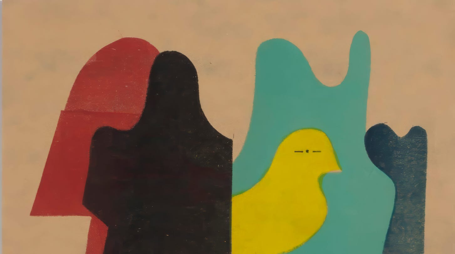
A spread from The Moderns by Steven Heller and Greg D’Onofrio
Modernism and me
THE BAUHAUS, the fount of modernist design that arose in Weimar Germany, was targeted by Nazis and closed in 1933. Several of its seminal figures, including Walter Gropius, László Moholy-Nagy, and Josef and Anni Albers, subsequently immigrated to the United States. In their beautiful new book, The Moderns: Midcentury American Graphic Design, popular art historians Steven Heller and Greg D’Onofrio follow the trajectory of those inspired by Bauhaus aesthetics to create a new graphic language that thrived in postwar America. The book is organized as an illustrated encyclopedia of the key figures and I’ve delighted in thumbing through them.
I experienced the modernist influence directly when I moved to Chicago in 1976 to design In These Times. Moholy-Nagy founded the Illinois Institute of Technology—initially called New Bauhaus—in that city in 1937. I was briefly tutored by one of its graduates upon arriving and I remember going downtown to see an exhibit by a professional organization of Chicago designers. It was uniformly modernist. The clean, boldly colorful, and often clever graphics were accompanied by type invariably set in narrow columns of nine-point Helvetica. By that time, the revival of humanist typography had already begun under designers such as Roger Black at Rolling Stone, but I was still considered something of an apostate in Chicago for setting our newspaper in Times New Roman! (See below.) Now overused and saddled with dozens of inferior knock-offs, I still find it a lovely typeface in the original cut, which was designed by Monotype’s Stanley Morrison for The Times of London.

THE FIRST ISSUE of In These Times included articles on the end of Mao’s reign of terror and a Woody Allen film review by a member of the Hollywood Ten. The Times Roman typeface I used has since become ubiquitous. Meanwhile, the publication itself has largely drifted away from the founders’ vision of building a new majority, favoring instead an appeal to a moralistic minority. But that’s a story for another day.
FONT VIDEO BREAK NO. 1
Chez Goines
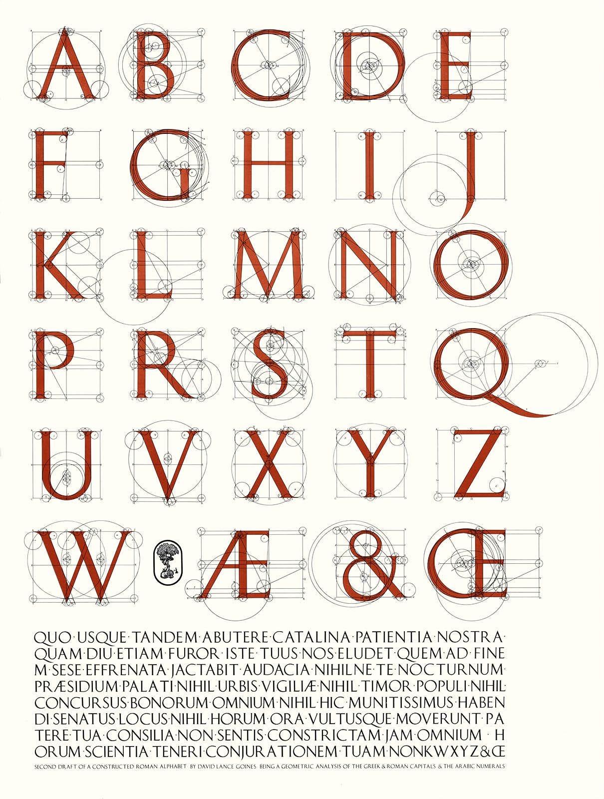
DAVID LANCE GOINES, who died in 2023, had his print shop on the first floor of a rose-colored building on Martin Luther King Way, three blocks from our former home in Berkeley. He was principally known for the posters he created for numerous East Bay events and organizations. Goines defined a certain North Berkeley aesthetic, along with his former paramour, Alice Waters, whose cookbooks he illustrated, posters he designed, and weekly menus he printed for her restaurant, Chez Panisse. They both helped revive the Arts & Crafts tradition that had thrived in the neighborhood in the early 1900s. A famous type designer from that era, Frederick Goudy, who created the Berkeley typeface now used by the university, had also lived for a time in North Berkeley. But his studio and drawings were destroyed by a devastating fire in 1923 that burned much of the neighborhood. Goines’ shop, Saint Hieronymous Press, was a few blocks from the Hillside Club, one of the remaining physical vestiges of the earlier Arts & Crafts period.
By coincidence, I just met someone here in Port Townsend whose sister is a bartender at the Chez Panisse and has lived in the Goines building for forty years. Goines was picky about who could rent there—several tenants were associated with the restaurant—and vacancies were rare. Luckily, when I was looking for an apartment for my nephew and his girlfriend, I had a referral from a friend of Goines. Dressed in black and sporting his signature handlebar mustache, he met us in the apartment and, after checking us out, agreed to the rental. But when I pulled out a checkbook to pay the deposit, he reeled back with a look of horror. “Oh, no, I do not deal with the filthy lucre!” he said and referred me to his accountant. This was the unrelenting anarchist and Free Speech Movement veteran who once wrote and printed a book about how to start a bar fight. And yet, what elegance and discipline he demonstrated in drawing these letterforms.
The Birds-of-a-Type Series

FOR A FEW MONTHS in 2024, I designed a weekly series of cards, just for the silly fun of it, that combined my interests in birds and typography. Then I ran a reader poll to pick the best of a dozen cards. These four were are the top vote-getters and the ultimate prize winner was Bodoni Booby (fitting, given the local craze that year over a Booby that wandered off its migratory path and into town). My personal choice? I’d prefer not to state, though who couldn’t love the Optima Owl, the Deco Duck, or the lovely Sabon Swans?
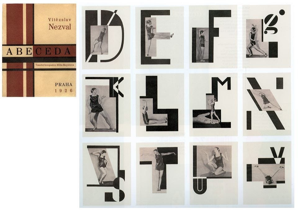
KAREL TEIGE was a modernist Czech artist and writer who introduced Paul Klee, André Breton, and Man Ray and other artists to Prague audiences. He also lectured at the Bauhaus. In 1926, he collaborated with the poet Vítězslav Nezval and choreographer and dancer Milča Mayerová to produce Abeceda—the alphabet book. Nezval’s poems accompanied each letterform montage designed by Teige, with obvious Constructivist influences (also see Zlom). The pair founded a movement they called Poetism that highlighted the sensual and playful in contrast to Czech modernists whose principal ambition was to join the class struggle and produce socially useful art. “I decided to reject any theme whatsoever, and chose the most abstract poetic object—the letter—as the pretext for the gymnastics of the mind,” Nezval said. But both remained committed Marxists and Teige welcomed the Red Army in 1945. Nonetheless, he was silenced and then denounced by the communist government, which destroyed his papers and suppressed his books. Thankfully, Abeceda survived.

THESE LETTERS are typographic artworks based on the ADLaM Display font commissioned by Microsoft and designed by Neil Patel, Mark Jamra, and Andrew Footit. They were inspired by the spots, lozenges, and chevron patterns found in traditional textiles of the Fulani culture. See Writing in Beauty in Wild Things for the amazing story of the invention of this alphabet.

THIS POPULAR handbill from 1782, entitled The Comical Hotch Potch, or The Alphabet turn'd Posture-Master and sold by Carington Bowles, No 69 in St Paul's Church Yard, London, inspired a modern composer named Carl Schimmel to write a musical score. He composed it for Flexible Music, a group that includes a percussionist and marimbist named Haruka Fujii. She is part of the leadership team with Rhiannon Giddens for Yo-Yo Ma’s Silkroad Ensemble. (I’ve been a Rhiannon Giddens fanboy for years.)
A Hotch potch is a jumbled mixture of different things, derived from the French word hocher or “shake” and also the name of a Scottish stew made with mutton. On the handbill, the alphabet is spelled out by 18th century dance masters and intended as educational fun for children. According to one source, “Following the custom of the times, the print has only 24 letters. "J" and "U" are missing as many people continued to use "I" and "V" respectively.” All this is to say that a lover of alphabets travels many roads, some of them dead ends. Try as I might, I could not find the original illustrator. (Update: see below)
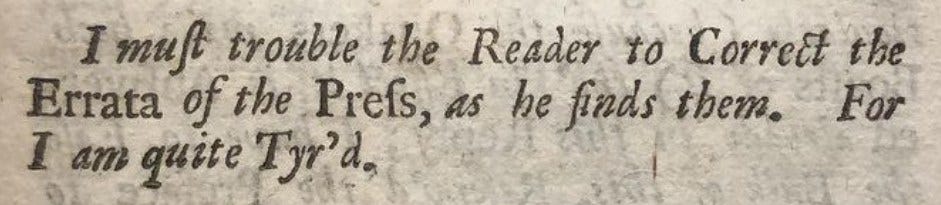
WILLIAM CASLON, the designer of this typeface, was born near the end of the 1600s. Caslon was the most popular typeface for English in the 1700s and is still in use today. (I’ve always been fond of it.) Benjamin Franklin purchased hundreds of pounds of the lead type from Caslon and it was the typeface used to print the Declaration of Independence. Errata (the plural of Erratum, a singular correction printed on a single page) were often published together at the end of a book. “Prefs” probably refers to the press that printed the book or handbill or poster—I can’t say exactly. After some effort tracking it down, I grew “Tyr’d” and gave up.
KUDOS and thanks to Tom Greensfelder who identified the artist behind the 18th century Comical Hotch Potch alphabet in last week’s edition of Wild Things. He is Richard Deighton. The publisher, Carrington Bowles, gave Deighton the “liberty to use contortions, perspective, and clothing to make legible letters.”
An alphabetic genius
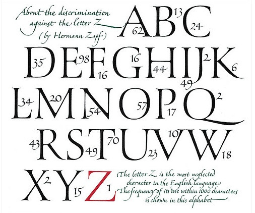
I BOUGHT a little blue book in the mid-1970s entitled About Alphabets. One of my first books on type design, it always occupied a prominent space on my studio shelf. The author, Hermann Zapf, is little known outside the cloistered world of type designers, but within it, he was a giant. He created an estimated two hundred typefaces, including Palatino and Optima He designed an alphabet for the Cherokee language. He designed dingbats. He adapted lead-type designs to photo-type and photo-type to digital type. All impressive, yet I most admire Zapf’s old-fashioned commitment to calligraphic and Roman letterforms—and his skill in producing them—as shown in his whimsical defense of the letter Z.
A Dutch master in wartime
DURING THE OCCUPATION of the Netherlands in WWII, a group of artists and writers founded an underground publication entitled De Blauwe Schuit (The Blue Barge), a reference to a medieval Dutch allegory about a ship of fools. Hendrik Nicolaas Werkman printed and illustrated the publication in his home town of Groninger for four years before his death. Werkman had already gained international attention for his type designs and printed pieces, including the innovative use of type as illustration. Before the war, he had been in regular correspondence with Eli Lissitsky and other artists influenced by Constructivism, which was associated with avant-garde typography. Battle for an Imprisoned Poet (above) reflects the core themes of De Blauwe Schuit—artistic freedom, resistance to the occupation and hope for a better future.
Werkman was not Jewish, but had an enduring interest in Jewish culture and mysticism. For De Blauwe Schuit, he created a series of illustrations, Chassidische Legenden (Hasidic Legends), inspired by the tales of the Baal Shem Tov, the founder of Hasidic Judaism. This, too, was an act of resistance, and in March 1945, the Gestapo arrested Werkman. With nine others, he was shot to death in a nearby forest, on April 10, three days before Groninger was liberated. Most of the archives of De Blauwe Schuit did not survive the war, but the Groninger Museum houses a collection of his works, which continue to inspire type and graphic designers.
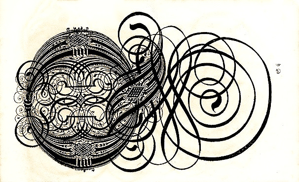
THIS PAGE COMES from a 17th century German book of calligraphy. The letters therein have more swirls than a whirling dervish and more swashes than a Caribbean pirate. I wager they are illegible to most readers. I’ve turned this letter on its side to get all the swirls in the frame, but identifying it remains a challenge at any angle. I’m guessing a “Q”. The book is titled with flourish as well: The Proper Art of Writing: a compilation of all sorts of capital or initial letters of German, Latin and Italian fonts from different masters of the noble art of writing. I have to wonder at the size of the paper and the number of attempts to create such a remarkable effect with a mere quill.
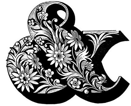
I’VE NEVER KNOWN a graphic designer that didn’t like an ampersand. Oh, there were probably a few from the nothing-but-Helvetica era that was winding down just as I was getting started in the mid-’70s. Roger Black’s Rolling Stone helped open things up, as did Herb Lubalin’s U&lc with its epic ampersand. Engraved in wood by Louis John Pouchée in London in the 1820s, this florid ampersand fortunately survived a fire at the Monotype Corporation headquarters in 1940. Pouchée produced the most ambitious and largest collection of wooden-type alphabets from the period.
FONT VIDEO BREAK NO. 2
Sans comedy
A VERY SMART FRIEND recently asked me: Why make such a big deal about type? I could tell by the quizzical look on his face that the question was sincere. But since typography has been such an enormous part of my life for decades, and I like this fellow, I had to suppress my stupefaction. The mantra of a favorite character in Ted Lasso— “Soccer is life!”—popped into my head. Type is life, I wanted to say. Instead, gathering myself, I explained that the history of typography is the history of writing—remember those calligraphic monks toiling away at their desks?—and therefore the history of recorded thought. Type, I pronounced, is all around you if you take the time to notice. Didn’t work. The puzzlement scrunched up on his face remained.
Well, this morning I ran across an article in no less an august publication than The Atlantic about the genesis and journey of a single typeface. Comic Sans went from a popular explosion after its almost accidental introduction in 1994 to a severe backlash from true type lovers to a severe backlash against the backlash, and finally to an un-ironic “meh.”
Comic Sans has long been the “Macarena” of fonts. Type aficionados don’t like it, the way coffee connoisseurs don’t like Starbucks. It is the font everyone loves to hate. But I love to love it. More than the typeface itself, I love the idea of Comic Sans: a set of letters that can make people suddenly intrigued, and sometimes cross. No other font gets people so worked up. When was the last time you had an argument over Garamond or Calibri?
Well, actually, I can get worked up over Garamond, especially in comparing the sloppy bastardized versions with the original cut by the 16th century French printer whose name it bears. (Calibri by Microsoft is milk-toast by design.) Still, I count an article on a typeface in The Atlantic as a win. Moreover, I learned that the article by Simon Garfield is an excerpt from his book, Comic Sans: The Biography of a Typeface. Another of his twenty books won the Somerset Maugham Award and he’s currently writing a history of the pen. Isn’t that proof enough of the central importance of typography in the history of humankind? And isn’t this true regardless of my sour distaste for the use of Comic Sans in anything other than comics?

Troo dat
TYPEFACES of this vintage are called Grotesque, which they are anything but. The term, from the Italian word “grottesco” refers to Roman decorative arts found in caves (grottos). Later, it was expanded to mean anything unusual or irregular or even shocking—which these new sans serif typefaces were when introduced to a 19th-century public long conditioned to seeing end strokes (serifs) on their letterforms. This playful treatment of a grotesque typeface on a Seattle Center building caught my eye last summer.

Ms. Fili
BY ANY MEASURE, Louise Fili is one of the great graphic designers of her generation, which is to say my own. She is best known for the book covers she designed for Random House, two thousand in all. A love of typography, particularly Art Deco fonts from Europe, infuses her work, which includes typefaces of her own design. Her most recent book is A Typographer’s Mother Goose, wherein the famous tales are illustrated with gorgeous letterforms and told in both English and Italian—her heritage and another important cultural influence on her designs. Researching her work, I learned of the Frederick W. Goudy Award, which she received along with many of the most distinguished type designers of the twentieth century, including Herman Zapf (featured in a previous Wild Things), Ed Benguiat, and Herb Lubalin, one of her early mentors. Not being a New Yorker, I only recently learned that she is married to Stephen Heller, a contemporary historian of graphic design that I’ve followed over the years. He is the co-author of the recently recommended book, The Moderns, whose bright red cover now greets me in my office. They have a son, Nico, who does video interviews with New York characters and recently produced a guide to the city’s hidden gems.