


Animating ideas and ideals
The Progressive origins of the Ahwahnee, ironies of on-the-job healthcare training, and a Bodoni Booby.

YOSEMITE: ARTISTS AND ARTISANS


Imagining The Ahwahnee
THE AHWAHNEE HOTEL in Yosemite National Park is a radiant monument to Progressive-Era ideas about art and society. The grand hotel’s design, from its massive stone exterior to the geometric patterns embedded in its floors and painted on its walls, reflects a worldview that thrived in the early 20th-century in the San Francisco Bay Area—and in particular at the University of California at Berkeley. Many of those who designed the look and feel of Yosemite’s thoroughfares and buildings had been molded by ideas about public art and architecture incubated in Berkeley classrooms and cafes.
These artists and architects reflected the values of their social set, which included the conservation of nature and a broader acceptance and curiosity toward other cultures. Like-minded colleagues cultivated new concepts in law, biology, and the social sciences that informed policies for managing park visitors and wildlife, particularly after the founding of the National Park Service in 1916 by a group of Berkeley alumni led by Steven Mather. “It was the air everyone breathed,” says Karl Kroeber, who recalls the many social gatherings at the North Berkeley home of his grandfather, the famed Berkeley anthropologist Alfred Kroeber. “In many ways, they saw Yosemite as their park.” Kroeber’s redwood home was designed, naturally, by Bernard Maybeck, himself the grandfather of an architectural tradition that courses through The Ahwahnee’s stone walls, stained glass, and ceiling stencils.
The Ahwahnee’s unique interior was the work of two designers, Arthur Upham Pope, a Berkeley philosophy professor, and Phyllis Ackerman, who was a student in the School of Architecture when they met. The couple married in 1920, and according to a New Yorker profile, they were soon “acting for some of the wealthiest people in the country,” purchasing rugs, tapestry, and pottery.
The Ahwahnee, built in 1927, is their masterpiece. The pair had complete oversight of the decoration, including choice of fabrics, rugs, paint, custom-made wrought iron lighting fixtures, and a wide variety of furniture, much of it custom crafted to their specifications. Taking inspiration from their beloved kelims—they commissioned several for the hotel—and Native American motifs from basket designs, the couple transformed the massive building’s interior into a work of art.
IN RETROSPECT, the Native American influence also reveals some of the tortured racial views afflicting socially progressive Berkeley at the time. California in the 1920s remained a xenophobic place. Although the blatant murder of Native Americans sanctioned in the early years of California statehood had receded, efforts to suppress Indian language and culture persisted, as did the relocation of tribes and villages, including within Yosemite as late as 1969. At the same time, Kroeber and other anthropologists were rushing to document California Indian languages and cultures that were rapidly being assimilated or extinguished. Results of their prodigious efforts, including a large collection of Miwok baskets, are located in the archives of the university’s Hearst Museum.
Jeanette Dyer Spencer, a Berkeley artist that Pope and Ackerman hired to paint the stencils adorning ceilings and walls of the hotel, consulted those archives to create her designs. Her artwork, and the Native American-inspired mosaics of the lobby floor by Henry Temple Howard echoed the geometric Middle Eastern designs that Pope and Ackerman loved. By explicitly associating Native American artisans with those of the ancient world, Ackerman hoped to show them as “creative artists of ingenuity, sensitiveness and dignity.” Meanwhile, Yosemite Indian basket weavers such as Lucy Telles and Maggie Howard were pioneering new designs for baskets just a few miles from The Ahwahnee. The absence of living Native American artists in designing the hotel reflects the painful ironies of the time.
If there is one place that offers a clarifying insight into the ideas and craftsmanship that animated Pope, Ackerman, Howard, Spencer, and their progressive-minded contemporaries in Yosemite and Berkeley, it is the Great Lounge. Since its completion and through its several iterations, guests entering the room for the first time often let out a spontaneous gasp. Set against the grandeur of Yosemite Valley itself, that appreciative gasp signals the enduring achievement of a group of pragmatic idealists who, for a luminous moment, shared an expansive if flawed belief that their public-spirited values, cultural broad-mindedness, and personal artistry could harmoniously combine to create something of beauty. And did.
—Adapted from “Yosemite: A Storied Landscape,” which I created for California Historical Society. A longer version of my Ahwahnee chapter is here. The entire book is free to download on Apple Books.
TALES FROM THE CLINIC
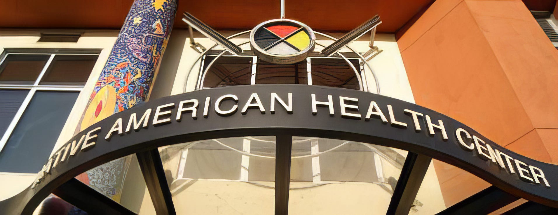
Staff training
By Barbara Ramsey
OUR CLINIC WAS FOUNDED by Native American activists and focused on caring for Native Americans, though we also served our entire multi-ethnic neighborhood in Oakland. We also made a point of hiring staff from among our patients. Most had little formal education and required a lot of on-the-job training, especially our receptionists. They were often the first point of contact for patients and needed to be warm and welcoming but also cool enough to handle difficult situations.
Shirley Kaiviti was our main receptionist. A Miwok native, she’d married a guy from Fiji, and had been a regular patient of ours for several years before we hired her. Tall and heavy-set, she wore her dark hair down to her shoulders and had a calm, impassive look and manner. She rarely expressed emotion and I never saw her perturbed in any way. She was perfect from the jump.
One morning Shirley came into my office and asked, “Dr. Ramsey, what causes seizures?” I was always keen to teach staff about health and disease. Shirley had never seemed very curious about medical matters, so I responded eagerly to her question.
“Well, a seizure is like an electrical storm in the brain,” I said. “Any one of us can have a seizure if our electrical signals get fouled up badly enough.” I didn’t want her to stigmatize a patient for being epileptic or “wrong” in the head.
“A lot of things can cause a person to have a seizure,” I said, and then went on to describe several of the common causes, including head injuries and withdrawal from alcohol. I explained how we all rely on regular waves of brain activity for consciousness and how disruption of those waves can cause us to lose consciousness.
Shirley listened patiently, just nodding her head. Finally I paused and Shirley said, “Cause somebody in the waiting room is having one.”
As I rushed to the front desk to investigate, I realized that the staff member needing some on-the-job training was me. Next time Shirley posed a medical query, I decided the best response would be, “Great question! Why do you ask?”
BIRDS OF A TYPE CARD SERIES

Bodoni booby
RED-FOOTED BOOBYS number in the hundreds at the astonishing Kilauea Point National Wildlife Refuge in Kauai. Kilauea Point is one of the best places in the world to observe pelagic birds and I’ve returned there several times over the years. The Boobys are especially noteworthy because they nest atop trees on the inner cliffs of the headland, which thrusts into the sea on the north shore of the island. Like the tropicbirds, albatrosses, shearwaters, and frigate birds, boobys like to soar on the updraft of the wind as it strikes the southern side of the headland. That enables a photographer to capture images of the birds at different elevations and angles, which is great fun. On a sunny day, this booby was flying high—and so was I.
THE THIN, FLAT SERIFS and stems that the Italian Giambattista Bodoni gave his signature typefaces were an innovation in the 18th century. Though based on classically inspired faces, especially Baskerville, which introduced more exaggerated thicks and thins, Bodoni’s typefaces are often referred to as “modern” or as “Didone” in honor of his contemporary and aesthetic soul brother, the French engraver and printer Firmin Didot. I’ve long loved these families of typefaces, of which there have been so many reinterpretations over the past couple of centuries. Fantastic italics and ampersands, too. Most recently, I based the graphics for a local arts organization, Northwind Art, on Didot.
I associate Bodoni with the traditional stark-black and scarlet-red lettering of a traditional Venetian public announcement and of the mid-century Harper’s Bazaar of Alexy Brodovitch, who famously challenged artists to “astonish me.” Most of all, Bodoni, due to its geometric shapes and flat serifs, lends itself to a kind of typeface “collage” that I love to do, stacking the letters and altering their sizes and colors. Barbara and I still display our wedding invitation, which pulls the design together around a large, red, ring-shaped Bodoni “O” in the word JOIN.
Birds-of-a-type is a regular feature that combines two of my obsessions—birds and typography. It’s a blast for me to design these cards and I hope you enjoy them.

P.S. I was asked by a reader to share a picture of our wedding invitation. The hummer was a gift from our niece, Meghan.

Oh, the Ahwahnee! Just absolutely gorgeous. What a lovely place to sit, contemplate and bask in the warmth. Yosemite has so much magic!
Another great clinic story, Barbara. I had a feeling...
I really think you're going to have to do a set of cards, or a book (!) when/if you ever finish the bird/font project!